HBO max: a Masterclass in Brand Confusion

The evolution from HBO Max to Max and back again became a visual diary of a brand trying to recover the equity it had deliberately left behind.
HBO Max started with something incredibly valuable already built into its name: HBO. Decades of programming had made those three letters a shortcut for quality, prestige and premium entertainment. When HBO Max launched, the new platform didn't have to build that perception from zero. It inherited it.
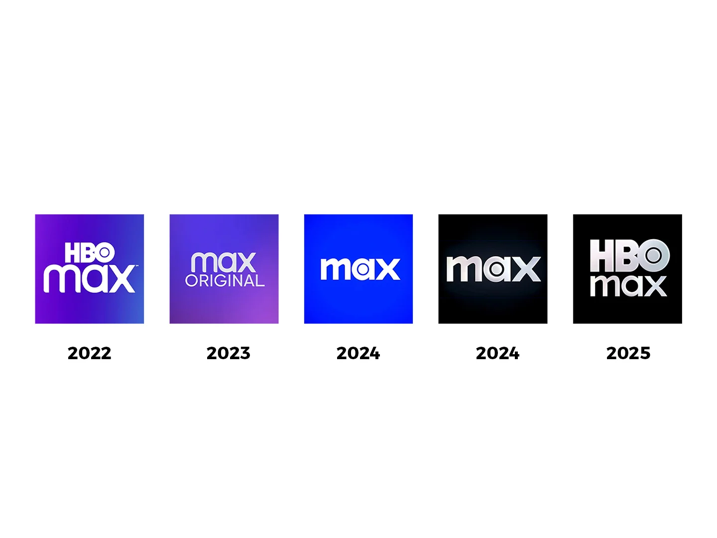
Then, in 2023, HBO disappeared and the platform was reintroduced simply as Max.
Strategically, the reasoning made sense. The service was expanding beyond HBO, bringing Discovery+ content into the same ecosystem and trying to become a broader entertainment platform rather than something perceived as exclusively premium television.
But there was a problem. “Max” had almost no meaning on its own. It could have been a cloud service, a bank, a telecom product or another tech startup. By removing HBO, the brand didn't just simplify its name. It removed the part carrying decades of recognition, memory and cultural positioning.
And what happened next is where the story becomes much more interesting.
In 2024, Max changed again. The typography became heavier and more commanding. More importantly, the letter “a” started carrying a familiar visual cue, a circular form strongly reminiscent of HBO's iconic “O.”
HBO was gone from the name, but traces of it were finding their way back into the identity. Almost as if the brand was quietly saying, “Remember HBO? This is still it. Kind of.”
Then came another shift. The identity moved toward black, colder, heavier and more authoritative. Visually, it felt closer to the prestige and cinematic seriousness historically associated with HBO.
But aesthetics can only carry so much meaning. You can borrow the visual language of heritage. You can't manufacture the heritage itself.
Eventually, HBO came back and Max became HBO Max again. That reversal says much more than another logo redesign ever could.
The valuable part wasn't simply a typeface, a color palette or an iconic circle. It was everything audiences already associated with those three letters: trust, memory, reputation and cultural equity.
Looking back, these weren't just logo changes. They were strategic negotiations happening through design. Each iteration seemed to move a little closer to the meaning the brand had intentionally removed. First through typography, then familiar shapes, then color and visual tone, until eventually the name itself returned.
It is a useful reminder that design is not a costume. A brand can change how it looks overnight, but the meaning attached to it takes years, sometimes decades, to build.
When a brand has accumulated that kind of emotional and cultural capital, it shouldn't be treated as unnecessary weight simply because the business strategy changes.
Brand equity is invisible, but sometimes you can see exactly when a company realizes how much of it it left behind.
Let's not Max out our mistakes.
Was this helpful?
Your reaction is anonymous